User aware website themeing made easy
TL;DR
A brief how-to automatic preferred theme detection for websites and how it is easily integrated.
Why
Since a couple of years most operating systems offer light and dark themes.
Till today most Websites either don’t provide different themes, simply ignore the user’s settings in OS and Browser or require a manual change of the theme by the user.
To show that it simply ain’t neccesary to spent this effort in theme switchers etc. within some „user settings pages“ by clever use of available web features, I wanna show you how the automatic theme switcher within my homecockpit blog website https://joachim.herwigs.info/projects/homecockpit is done.
It provides automatic detection of the user preferred theme (dark / light) and switching of the website theme without the need of spending lots of efforts into a seperate theme.
All the website has been designed for a light theme (white backgrounds etc.) and then afterwards assigned an additional _darkmode which is included into the styles.sass via the
@use 'darkmode'
directive.
The darkmode-sass just takes care about only a few things as in general I did not have to declare too much stuff to get to an quite ok looking dark theme that is applied automatically when the user has set his Theme preferance to „dark“.
@media (prefers-color-scheme: dark)
  html
    background: #111111
    color: #ffffff

  .counter-item object:not([data="img/icon_annunciator.svg"]), .menu-wrap .hamburger
    filter: invert(0.8)

  .atc
    color: #c87f48

  .acft
    color: #7389c0

  h1, h2, h3, h4, h5, a:not([href])
    filter: brightness(1.2)

  .themeable
    filter: invert(0.93) hue-rotate(180deg)

  ::-webkit-scrollbar
    background: #333333

  ::-webkit-scrollbar-track
    background: #333333

  ::-webkit-scrollbar-thumb
    background-color: #444444
    border-radius: 5px
    border: 1px solid #444444
All the magic is done by the media query
@media (prefers-color-scheme: dark)
And some filters to invert the colors with small adjustments for instance to headlines, which I kept with the original color tone but made it brighter. That brings the big benefit, that if I want to change the original colors for instance from a blue tone to a red tone, it is automatically applied to the dark theme as well without requiring any changes in there.
The change of only one single color for headlines and links would have the following effect:


The Page logo which is of course an SVG also received an theme switching block:
<svg>
  <style>
    @media (prefers-color-scheme: dark) {
      #g4476 {
        filter: brightness(3);
      }
      #path4535 {
        filter: invert(1);
      }
      #flowRoot4516 {
        filter: brightness(1.5);
      }
    }
  </style>
  ...
To ensure that the logo is dark-theme compatible as well.
So no matter wheter you set „dark“ or „light“ as „your mode“ within your OS, If the browser-setting is also to „Standard“, it will be handed through to the website and reflected within the style.


Just see the examples, which effect these few lines of code require. And I didn’t need to add some „feature“ for theme switching within the website itself.


Das könnte dich auch interessieren
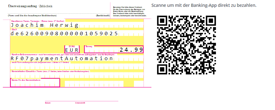
payment automation
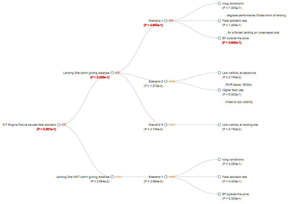
Fault-tree-analysis (FTA)